

READ OR LEAVE A COMMENT
SHARE POST
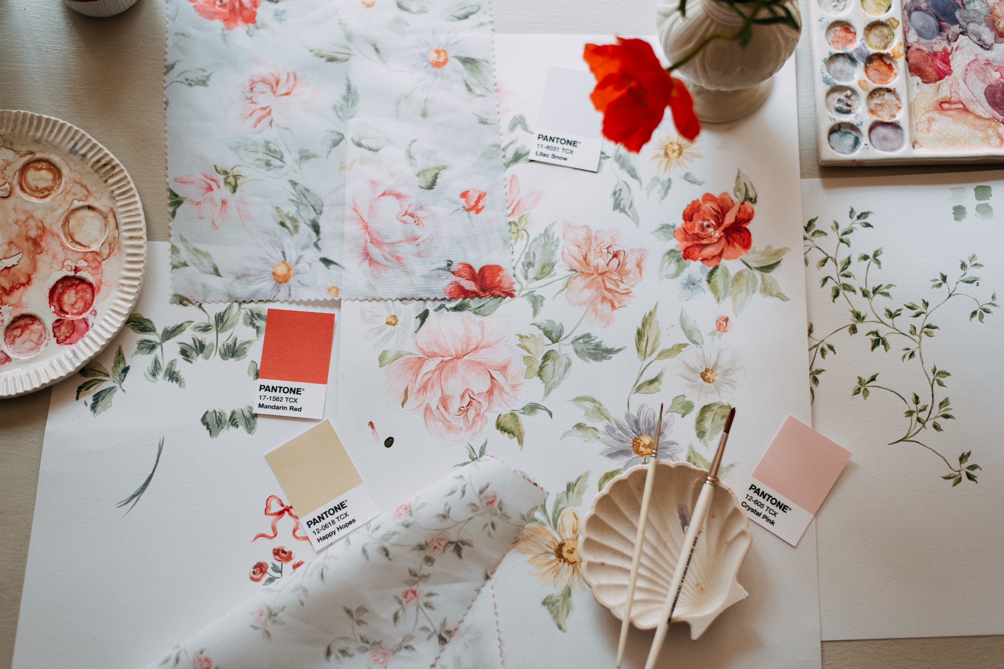
7 Things I Think About Before I Ever Pitch a Collection
I once had a collection sitting on my hard drive for months.
Every time I opened the folder to tweak it just a little more, I felt genuinely proud of what I had created. The illustrations were detailed, the colour palette was considered, and the theme felt cohesive to me. I had poured so much time into it, creating in the margins of a full season of life, fitting studio hours around a then-newborn and the business side of the studio.
When I finally pitched it to a brand I had admired for a long time, I never heard back.
That ache rose up in me. That familiar feeling of rejection. But with a little time and perspective, I came to see what was actually true. I had made two mistakes I now see so often in artists building their first licensable collections.
I had designed it as a gallery of beautiful prints, not as a thoughtful solution to a brand’s specific, seasonal need. And for a moment, I let the success of the entire collection rest on one email.
The hard truth about beautiful work
If you have ever finished a collection, felt excited about it, and then watched your pitch land in silence, I want you to know this: it is not always about the quality of your work.
Sometimes it is about context, readiness, and the way the collection itself was built.
Here is what I know to be true after years of creating, pitching, and licensing my art: a licensable collection is not simply a group of lovely patterns. It is a cohesive, intentional body of work that answers a question a brand is already asking.
Once you understand what that actually looks like, the way you approach creating begins to shift.
You also come to understand that silence is not always personal. Inboxes are full. Timing can be off. And the art of following up, with dignity intact, does not make you less. It makes you committed to a process that others often abandon.
But more on following up in another post.
These are the seven things I think about before I ever pitch a collection.
1. Context is everything
A pattern on its own can be genuinely beautiful. But licensing is not only about the standalone artwork. It is about whether that artwork fits the moment a brand is in right now.
Before I pitch anything, I ask myself:
Is this collection seasonally appropriate?
Does the colour palette make sense for where this brand typically sits this time of year?
Is this the right theme for the products they are currently developing?
Brands plan collections months in advance. A pitch that arrives out of season, or carries a colour story that does not match their current direction, is going to land with a quiet thud, no matter how strong the artwork is.
This is why many no’s are not verdicts on your talent. They are often the result of a lack of research.
That is actually good news.
It means you can study a brand’s seasonal rhythm, understand what they tend to release and when, and pitch with far more intention instead of simply hoping for luck.
2. Your motifs need to live beyond one print
When a creative director looks at a collection, they are not seeing one pattern in isolation. They are imagining an entire product range.
They are picturing your motifs on a pillowcase, a gift bag, a notebook cover, wrapping paper, a onesie. All at once. All needing to work together.
This is why designing in a collection structure matters so much.
A well-built collection usually has three layers.
Your hero print is the most detailed and complex design. It anchors the story and sets the tone.
Your coordinate prints pull elements from the hero and rearrange them in simpler, more focused ways.
Your blenders are the quieter designs. Smaller in scale, easier to pair, and incredibly useful for tying the whole collection together.
One of the most freeing things I discovered when building my own collections is that you do not always need to paint everything from scratch.
When my hero print is particularly detailed, I often rearrange those same motifs into new placements and scales for the coordinates. It makes the collection feel richer, not because I am working harder, but because I am working more intentionally.
3. Your collection needs a story a buyer can use
Everyone has a different take on story-led design. Mine is that story is the strategic thread that connects every design decision, and one of the most practical tools you have when it comes time to pitch.
When I plan a new collection, one of the first things I write is a short story statement. Usually just two or three sentences that capture the mood, the setting, the key imagery, and the feeling the collection should evoke.
For example:
Embrace the untamed beauty of the wild. Intricate safari-inspired motifs with a contemporary boho feel. An adventure where wonder leads the way through golden grasslands.
It sounds poetic, yes. But it is also incredibly practical.
It gives me a filter for every decision I make as I paint. It helps me ask, does this motif belong here? Does this palette support the feeling? Does this print still sound like the story I am trying to tell?
And when I send that collection to a brand, it gives them something valuable too.
It gives them language.
Language for a buyer.
Language for a product page.
Language for a photographer.
Language for their team.
Brands are not just licensing artwork. They are licensing a story they can build a product line around.
When your collection has a clear narrative, you make their job easier. And an easier pitch is almost always a stronger one.
4. Product application matters more than you think
This question has stayed with me ever since I began thinking seriously about what makes art licensing work:
Is this design practical, or is it just pretty?
If you are designing wallpaper, you have the full luxury of detail. You can layer intricate botanicals, fine linework, delicate textures, because the work will be reproduced at scale. The detail is part of the point.
But if you are designing for baby clothing, small-format stationery, or gift wrap that will be printed at a fraction of the size you painted it, that same detail may simply disappear in production.
What reads as beauty at full scale can become visual noise at a small one.
Knowing your product application before you pick up a brush, and allowing that knowledge to shape your choices around scale, detail, and composition, leads to much more considered work.
When I think about the end product before I begin, my collections often become more versatile, not less.
A design built with wallpaper scale in mind can still translate to stationery or fabric if the motifs are clear enough. Thinking about application can actually expand your reach, even if at first it feels a little limiting.
5. Brand fit matters
Brands have a look.
They have a visual identity they have spent years cultivating, and their customers come back for it for a reason.
When I prepare to pitch a brand, I spend time studying what they have already made. I think about the words I would use to describe their aesthetic.
Whimsical and warm.
Bold and graphic.
Muted and heritage.
Playful and bright.
Then I ask myself, honestly: does my collection carry those same kinds of cues?
If a brand has spent years building a soft, botanical, heritage-feeling range, they are not likely to suddenly introduce a vibrant, contemporary, maximalist collection, no matter how technically impressive that artwork is. It simply does not fit the story they are already telling their customer.
This is why researching target brands before you pitch, and ideally before you even create, changes everything.
It is not about flattening your style or chasing someone else’s.
It is about choosing the right brands for the work you make, and creating work that was always meant for where it is going.
That shift changes everything.
6. Show your collection on more than one colour ground
This is one of the most practical things I now think about in every collection I develop, and one of the most common gaps I see in early-stage pitches.
If every print in your collection sits on a cream or white background, a brand cannot fully see how your artwork behaves across different environments.
What does it look like on a deep forest green?
A dusty blush mid-tone?
A warm charcoal?
A soft ochre?
I try to make sure every collection includes a range of colour grounds: light, medium, and dark.
This does two important things.
First, it shows that your artwork is flexible enough to anchor a bold product or accent a quieter one, depending on what the season calls for.
Second, it signals that you think like a product designer, not only a painter. It shows that you understand how your work will live in the real world.
The beauty of this is that colour ground variations do not require painting everything all over again. Once your artwork is digitised, it is relatively simple to recolour backgrounds and demonstrate that range.
But the impact on a pitch can be significant.
It answers a question before a brand even has to ask it.
7. Build with a destination in mind, even before you feel ready
This last one is especially for the artists who are still in the building stage. The ones who are not quite ready to pitch yet, but are quietly, steadily creating.
Do the research now.
Look at the brands you genuinely want to be designing for one day. Study their product lines. Notice their colour palette preferences, the kinds of motifs they return to, their seasonal rhythm. Save references that resonate.
Then, when you sit down to work on your next collection, let that research gently inform your choices.
This is not about designing to a brief that does not exist yet.
It is about building an intentional body of work that is already aligned with the market you want to enter, so that by the time you are ready to pitch, you are not starting from scratch. You have been working towards it all along.
When I started doing this, I could close the endless inspiration boards, choose a clearer niche, and create with far more purpose.
My work became more cohesive.
My direction became more confident.
And when the pitch moment came, everything was already pointing in the right direction.
Planning with a destination in mind does not box you in.
It gives your creativity somewhere real to land.
What changes when you create with both art and product in mind?
I want to come back to the question underneath all of this, because it is the one that matters most.
What would change if you created with both beauty and product in mind from the very beginning?
My answer is: almost everything.
Not in a way that makes the work feel less personal. In a way that makes it more impactful.
The most beautiful licensed collections I have ever seen are the ones where you can still feel the artist. Their hand. Their story. Their genuine love for the subject. Present in every design.
And they are also collections that clearly belong on a product, in a home, in someone’s daily life.
That is the intersection where art licensing lives.
And it is absolutely where your work can live too.
You do not need to wait until you feel fully ready, fully polished, or fully certain.
You need to understand what you are building and why.
Then you need to begin.
And keep returning to the work.
Your next step
If you are building your first licensable collection and would love a clearer framework for how to structure, plan, and pitch it, join my email list here for updates on new posts and resources. I share behind-the-scenes insights on collection planning, licensing, and building a creative business that fits real life.
And if you are ready to go deeper, you can join the Brush to Brand waitlist, my signature course that walks you through the full journey, from creative identity to a pitch-ready portfolio, at your own pace and in your own season.
Your work deserves to travel beyond the sketchbook.
I would love to help you get it there and I hope this post was a wonderful start!


Thank you for this article! It’s so helpful. I’m just wondering if there is a general guide for fabric companies as to when they are looking for their next Spring collection for example – is it the Autumn before?