

READ OR LEAVE A COMMENT
SHARE POST
From page to pixel
I remember the first time I learned how to turn my paintings into repeat patterns. I saw my artwork glowing on the screen in front of me. Slightly imperfect. Wonderfully alive. Still mine, but now existing in two worlds at once.
I had been at my desk, working with a single hand-painted flower. The moment I realised I could scale it, shift its colour, rotate it, and place it into a repeat, I first understood what digitising my artwork could truly mean for my business. I could now build an entire coordinating collection from a few motifs.
What might once have taken weeks of new painting could suddenly exist as a full family of designs inside a single working file.
It felt a little like discovering a door in a wall I had walked past every day, magical and full of possibility. And once I understood the process, I could not unsee it.
Every illustration I painted from that point forward became something more.
Not just an artwork. An asset.
This post is for every traditional ink, watercolour or acrylic artist who paints beautifully and has wondered how the painted world connects to the digital one. How a motif becomes a repeat. How a sketchbook page becomes something that might one day live on a fabric bolt, a nursery wall, or a gift bag on the other side of the world.
And perhaps most importantly, why the bridge between the two is far more intuitive than the internet would have you believe.
The gap between beautiful and repeat-ready
If you have ever stood at your desk with a finished painting and thought, I want to do something with this, but I have no idea where to start, this is for you.
If you have been quietly circling the idea of surface pattern design but felt stopped by the technology, the software, or the sheer scale of what you do not yet know, I want to gently encourage you that the place to start is closer than you think.
You do not need to master every tool before you begin.
You need to understand the entire process in a day.
One gentle step at a time can do more than waiting for “perfect” and only having the possibility exist as an idea in your mind.
At its core, digitising artwork from my perspective is this: sketch with intention, paint with flexibility, scan with strategy, arrange with feeling, and refine with purpose.
Let me walk you through each step.
Step 1: Sketch and plan your motifs before you pick up a brush
The thing that separates a surface pattern from a beautiful painting is not skill. It is an intention.
- Before I reach for my brush, I spend time in what I think of as motif planning.
- What is the story of this collection?
- What is the hero element, the piece that will carry the visual weight of the whole feel?
- What are the supporting characters, the mid-scale elements, the smaller fillers that will create rhythm and movement?
- And what does the colour feel like?
- What season is it for?
- Whose hands or homes do I imagine it in?
For me, this planning stage often happens with a pencil and a loose set of references. I give myself an hour or two maximum or you can get stuck here.
The goal is not to perfectly draw the finished artwork.
It is to map out the ecosystem of a family of prints before you invest hours of painting time.
A hero motif that tells the story. Some mid-scale elements. A few delicate fillers.
That is always a collection in skeleton form for me.
New ideas of things to add can develop along the way, but having that vision before you begin changes the way you paint everything.
Step 2: Paint with flexibility in mind
No one explained it like this to me, but I’ve come to understand that the way you paint for surface design matters just as much as what you paint.
When I create motifs for pattern work, I paint each element with breathing room around it. I leave space at the edges and I avoid blending motifs directly into each other on the paper unless it serves a stylistic purpose. I think of each flower, leaf, or creature as a separate object, because later I will be lifting it digitally, scaling it, adjusting its colour, and rotating it or layering it into position.
Each motif needs to be able to live on its own.
Before I scan anything, I ask myself two questions:
The first is, is there a detail I want to add that feels a little risky? If the answer is yes, I scan the painting first. That way I have a clean version saved before I attempt anything that might not work.
The second question is simple: Is this done? Are all the essential details in?
Painting with flexibility in mind is one of the smallest adjustments you can make, it makes you see the artwork as more fluid than final and it has an impact on everything that comes after. We can get precious about perfecting artwork to the point of never completing. Surface pattern design and digitally creating with hand-painted elements has opened up my world up to seeing everything as a moving part. As a result, there’s a flow and rhythm in the process that carries you forward instead of allowing you to find safety in a perfection rut that keeps the work hidden.
Step 3: Scan, clean up, and stop overthinking the scanner
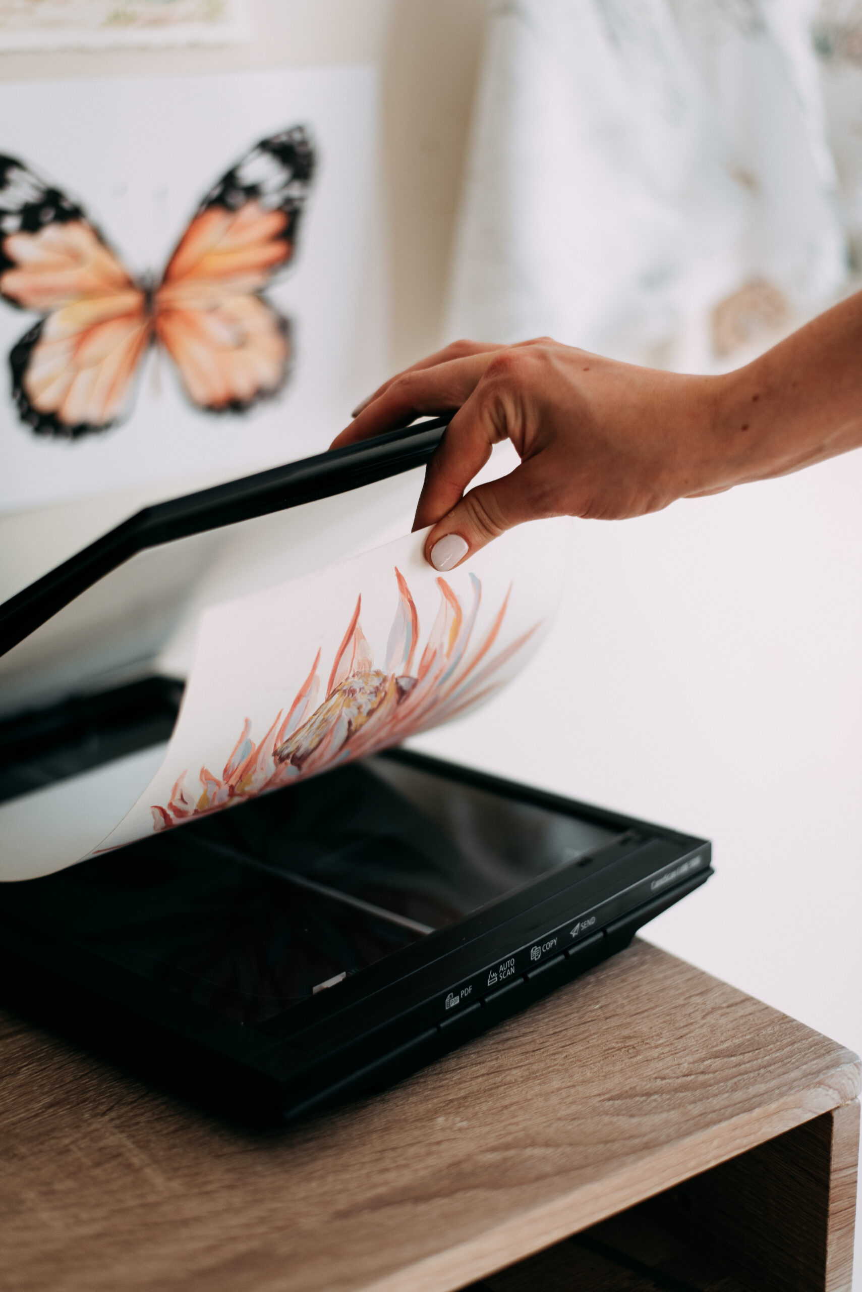
Artist to artist, the stage that most of us overcomplicate is not the repeat itself. It’s choosing the scanner.
I have watched talented painters spend weeks in research paralysis, trying to find the right one before they have scanned a single piece of work. And what I want to say, clearly and kindly, is this: the scanner matters far less than the act of scanning. Great options to get going are Epson Perfection V39II
A clean, high-resolution scan gives you a workable file. What you do with it is what builds the skill.
That skill, moving artwork around, sensing when a layout has rhythm, knowing when something needs more room or another filler motif, only comes with feel and repetition. Just like learning to paint did.
You do not master it by researching it. You master it by doing it, imperfectly, and then doing it again and again.
Scanning resolution:
- 300dpi for stationery goods and printing for up to A3 scale
- 600dpi (It’s higher, but I use it as my baseline, so I have great quality for future uses if scaling for wallpaper, even if I don’t need it now)
- 1200dpi This is an intentional choice because you know you’ll be reproducing the artwork at a very large scale (A1 or A0 prints or your niche is High-Texture Media wallpaper)
600dpi is my baseline because I predominantly work in children’s clothing, quilting fabrics and wallpaper.
Then, prepare artwork for design in your editing software.
I use Adobe Photoshop to remove the background, edit colour and any unwanted marks or discolouration. Save design-ready artwork as TIFF files, as they are lossless and do not compress. PNG files are also acceptable and high resolution.
And here is something worth sitting with: I treat the digitising process as a creative loop.
Sometimes I scan a painting, start working with it in a repeat, and realise I am missing a grounding element, a second leaf, or a colour note that would help the collection feel more complete.
So I go back and paint it. The digital and the painted are always in conversation.
That back-and-forth is not a flaw in the process. It is the process.
Step 4: Arrange your repeat with frameworks, not force
Now comes the stage that feels both technical and deeply intuitive.
There are several foundational layout types called “frameworks” used in surface pattern design, and I teach six of the most versatile ones inside my course Brush to Brand.
A framework is like the invisible scaffolding that keeps a design consistent when it’s printed or scaled.
Here’s an overview:
- A grid repeat, which is clean, it’s simple, it’s the most reliable framework, great for beginners.
- A half drop or brick repeat is something that brings soft movement and flow into a pattern.
- A diamond or trellis repeat has the quite a strong geometric element but it also is quite sophisticated and can become really interesting when you use those grid lines to create things like flowing ribbons or botanicals wrapping around the the diamond shape
- An ogee or the lattice repeat, which is a bit ornamental, but it has a lot of curves and soft elegance, and certainly has a place within a collection.
- A rotational or medallion repeat, which is all about symmetry at a core centre and lines that move around it to create a lot of visual harmony.
- A Tossed or scattered repeat which is quite organic, all about creating balance with negative space and objects at different angles with the right amount of negative space between them.
When you use a framework to design and allow your motifs to breathe, to settle naturally, and to create movement that feels easy rather than overly engineered, the handmade quality stays alive in the digital file.
I usually begin with a hero motif placed more organically. Then I bring in supporting florals, leaves, and fillers to create balance around it. The hero carries the feeling. The supporting motifs carry the rhythm. The smaller blenders add structure and help the whole collection come together.
What makes a repeat feel natural instead of forced?
Variation in scale. Considered negative space. Motifs that complement rather than compete. A layout that leaves room for the eye to move. And trusting the eye you have already developed as a painter, because that same eye knows when something is working.
A repeat is not only about technical alignment. It is about visual rhythm.
Step 5: Refine for collection use and watch one flower become many
This is where a few painted elements genuinely become a whole collection.
Once your artwork is digitised and you have a framework in mind, you can adjust colour, scale motifs up or down, create coordinating designs, and build an entire family of prints from a painted set of elements.
What might once have taken weeks of new painting can now be expanded into a licensable collection in a fraction of the time.
This matters enormously when you are running a creative business on your own because time is one of the most precious things you have.
And when every illustration becomes an asset rather than simply a finished piece, your library compounds. You are not starting from zero every time. You are building on a foundation that grows each time you paint, scan, and refine.
A quick note on software and vectorising
I want to gently address something that comes up often at this stage: which software to use, and whether traditional watercolour artists need to vectorise their work.
In my experience, the answer is usually no.
My own practice is roughly a 70/30 split between raster and vector, and in all my years of working with clients who specifically seek out hand-painted illustration, I have never once been told that a prepared, high-resolution scanned file needed to be vectorised.
The brands looking for hand-painted work are looking for it because of what it offers: texture, warmth, and the unmistakable quality of a human hand.
In a design landscape increasingly shaped by generated and synthetic imagery, I genuinely believe traditional artists are moving into a period of real distinction.
The hand-crafted, hand-painted aesthetic is not a limitation. It is becoming a quiet kind of luxury.
And the artists who understand how to bridge their painted work into the digital world will be the ones best placed to offer it.
The bridge has always been there
The distance between a hand-painted motif and a professional repeat pattern is not as wide as it looks from where you are standing.
It is a series of small, practised steps and each time you take them, the distance closes a little more. Your sketchbook is no longer the destination for your work. It becomes the beginning of it.
I built a significant part of my illustration library slowly, one motif at a time, often while navigating the very full life that most of us are living alongside our creative work.
What I know to be true is this: the artists who keep going, who scan imperfect work and build average repeats and keep showing up to the process, are the ones who eventually have something extraordinary.
My best designs wouldn’t exist today if I didn’t have the courage to begin imperfectly, not having something to prove, but having something to learn, something to gain.
You do not need to have it all figured out before you begin. But you do need to begin, and let the figuring out happen in the doing.
If you read this post and in any way feel behind, know that you’re not. You are simply building at a different pace, and small, gentle steps still grow big things.
If you want to be guided through the journey
If your heart is set on learning how to turn your painted artwork into repeat patterns and licensable collections with more confidence and far less overwhelm, I would love to invite you to join the Brush to Brand waitlist.
Inside, I teach the full process from page to pixel: planning motifs with intention, digitising your artwork, building repeats, creating collections, and developing the kind of creative business that can actually grow alongside your life.
It is the course I built for artists who are ready to move from beautiful work to a professional and sustainable creative practice.
[Explore Brush to Brand here →]
If you’re not yet ready to dive into a course, save or pin this post and come back to it when you need a reminder that the painted and the digital can belong together! I hope it met you where you are and gave you some valuable ideas and processes to consider.
And if you want to stay close to this kind of teaching before you are ready for the course, I would love to have you on my email list. [Join me here →]


